
How to Draw Abstract Japanese Calligraphy and Geometric Pattern Art
Learn how to create an abstract artwork that blends Japanese calligraphy-inspired strokes, modern geometric patterns, and rich golden textured panels in a balanced composition.
In this lesson, we are going to build an abstract artwork inspired by Japanese calligraphy and modern decorative pattern design. This is not about copying one exact symbol. Instead, we are learning how to create a strong visual rhythm using flowing ink-like strokes, structured geometric shapes, and textured golden side panels.
We will begin with the main layout, placing the frame, center area, and gold panel zones. Then we will draw the calligraphy-inspired movement through the artwork, keeping the strokes expressive but controlled. After that, we will add geometric pattern details to create contrast against the organic calligraphy lines. In the final step, we will finish the piece with shading, texture, darker accents, and clean edges.
Take your time with the balance. Abstract art still needs structure. The calligraphy strokes should feel alive, while the patterns and golden panels should hold the composition together. Think of this as a quiet conversation between movement and order.
Tools Required
- 2H Pencil for light layout guidelines
- HB Pencil for sketching shapes and patterns
- 2B Pencil for darker calligraphy strokes
- 4B Pencil for deep shadows and texture
- Black Fine-Liner Pen or Brush Pen
- Gold Colored Pencil or Gold Marker
- Blending Stump or tissue
- Kneaded Eraser
- Ruler
- A4 Drawing Paper
Step-by-Step Instructions
Set the Frame, Golden Panels, and Main Composition
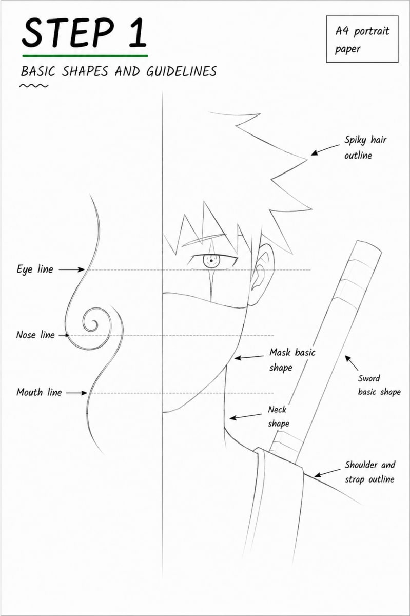
Focus: GuidelinesStart by lightly marking the full artwork area on your A4 paper. Use a ruler to keep the outer frame clean. I like to divide this type of piece into three main zones: a central artwork space and two rich side panels that will later become the golden textured areas. Keep your pencil pressure light. Draw the vertical panel borders first, then mark the center area where the calligraphy movement will sit. Do not add heavy details yet. At this stage, we only want to understand the balance of the page. Before moving forward, check the spacing. The golden panels should feel like they are framing the artwork, not squeezing it. The central area should have enough breathing room for large calligraphy strokes and smaller geometric patterns.
Draw the Main Calligraphy-Inspired Flow
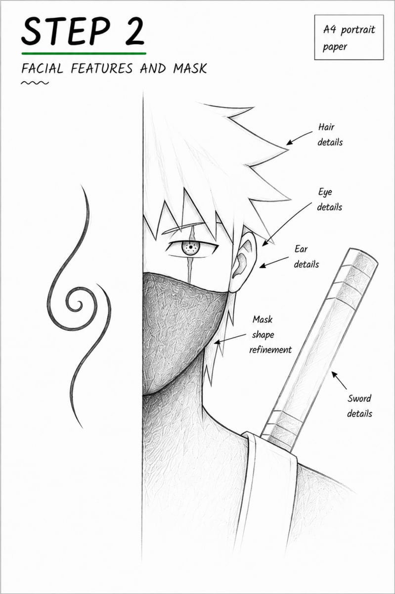
Focus: Line ArtNow we begin the calligraphy movement. Use loose, confident lines to sketch the main abstract strokes in the center area. These strokes should feel inspired by Japanese brush calligraphy, but they do not need to form a real character. Focus on rhythm, direction, and pressure. Make some lines thicker and some thinner. Let a few strokes curve naturally, while others break sharply to create energy. The strongest stroke should guide the eye through the artwork, almost like a path. Do not make the calligraphy too crowded. Leave open white space between the strokes. That empty space is important because it gives the abstract design elegance and makes the final pattern easier to read.
Add Geometric Patterns and Decorative Structure
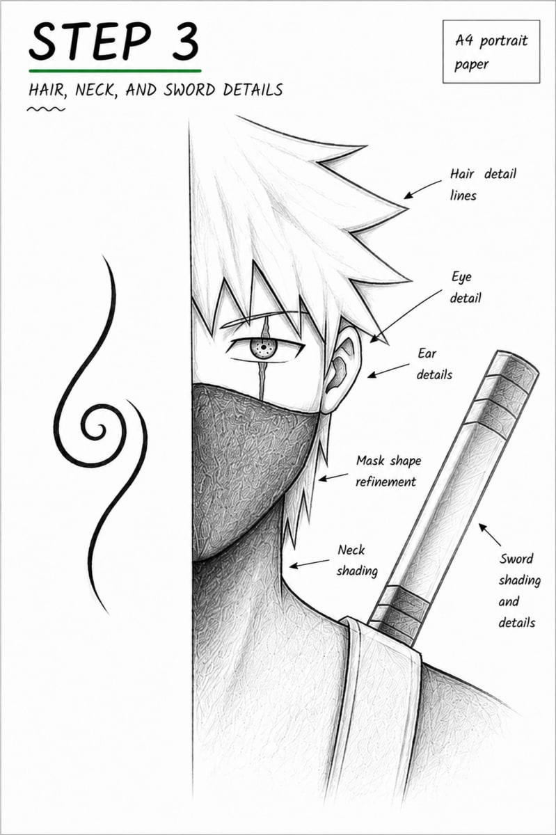
Focus: DetailsNow add the modern pattern details around the calligraphy strokes. Use simple geometric shapes such as lines, triangles, small rectangles, circles, grids, or repeating border marks. Keep these shapes controlled so they contrast with the loose calligraphy movement. Place the patterns carefully. Some can sit inside the central space, while others can decorate the golden side panels. Try not to cover the strongest calligraphy strokes. The patterns should support the movement, not fight against it. This is the step where the artwork starts to feel unique. The organic brush-like lines give emotion, while the geometric shapes give structure. Keep stepping back and checking the full page so the design stays balanced.
Finish the Gold Texture, Dark Accents, and Final Balance
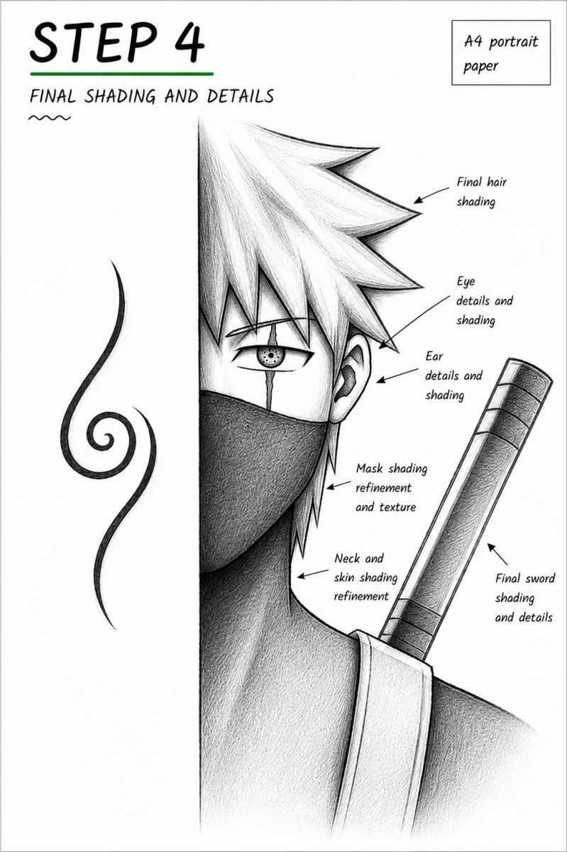
Focus: ShadingIn the final step, clean the main outlines and strengthen the contrast. Darken the calligraphy-inspired strokes with a 2B pencil, 4B pencil, fine-liner, or brush pen. Make the strongest areas bold, but leave a few lighter strokes so the artwork does not become too heavy. Now build the golden panels. Add gold color in light layers, then create texture with small pencil marks, soft shading, and uneven pressure. The panels should look rich and textured, not flat. Add darker edges or small shadow areas to make the gold feel framed. Finish by cleaning any messy construction lines. Check the full composition one last time: the calligraphy should feel expressive, the geometric pattern should feel intentional, and the gold panels should frame the piece with warmth and depth.
Is this abstract calligraphy pattern tutorial good for intermediate artists?
Yes. This guide is best for intermediate artists because we are balancing free calligraphy-style strokes with structured geometric patterns and textured golden panels. The drawing is not technically difficult, but the composition needs control.
Do I need to know real Japanese calligraphy to draw this artwork?
No. This lesson is Japanese-inspired, but it does not require writing a real kanji or calligraphy character. We are borrowing the feeling of brush movement, line weight, and rhythm to create an abstract design.
How do I make the golden panels look textured?
Build the gold slowly in layers. Use uneven pencil pressure, small directional strokes, soft shading near the edges, and a few darker marks to create depth. Avoid coloring the panels as one flat block.
How do I balance calligraphy strokes with geometric patterns?
Let the calligraphy be the main movement and use the geometric patterns as support. Keep the biggest strokes clear, then place smaller shapes around them. If the page feels too busy, remove some pattern details and leave more white space.
What should I focus on most in this abstract artwork?
Focus on contrast and balance. The calligraphy strokes should feel loose and expressive, the geometric patterns should feel clean and organized, and the golden panels should add warmth without overpowering the center design.